Blog
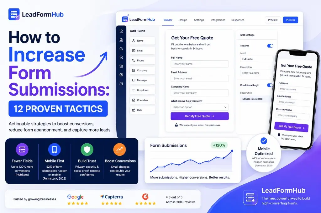
How to Increase Form Submissions: 12 Proven Tactics
By LeadFormHub Editorial Team · Published 20 February 2025 · Last updated: 7 June 2026
Lead gen + CRO writers
You’ve got traffic, but your form isn’t filling up. Most forms leak leads for simple reasons. You can fix them fast. Use these 12 tactics to increase form submissions and reduce form abandonment.
The average form conversion rate sits around 3% for many sites. That means most visitors leave without filling your form. (Source)
If your contact form is not getting submissions, you’re not alone. Most forms lose leads quietly. You might not see the leak until your pipeline feels thin.
Below, you’ll learn why people don’t fill out forms. You’ll also get 12 lead form best practices you can apply today.
Why your form isn't getting submissions (the real reasons)
Too many fields
Too many fields create friction. Each field adds effort and doubt. One widely shared benchmark shows a big lift when you cut fields. Reducing from 10 fields to 4 can increase conversions by up to 120%. (Source)
Poor mobile experience
Many people will open your form on a phone. Tiny fields, small buttons, and slow loads kill taps. Mobile issues are a top form abandonment reason. Start by testing your form on a real phone. Then fix spacing and input sizes.
Weak CTA copy
“Submit” feels cold and vague. Action-based copy can perform better. Many CRO studies show clearer, benefit-led buttons lift clicks. This is one of the fastest ways to increase form conversion rate without redesign.
Lack of trust signals
People fear spam and unwanted calls. If your form has no proof, they hesitate. Add a short privacy line and one trust cue near the button. A testimonial, rating, or “no spam” promise reduces doubt.
Want a fast baseline? Start with field count. Then check mobile and CTA copy. This pairs well with our guide on lead form landing page checklist.
12 tactics to increase form submissions
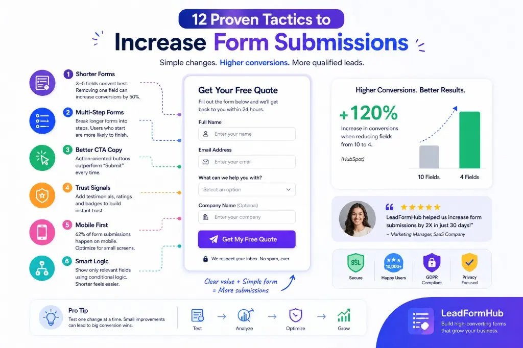
1. Cut your form to 3–5 fields max
Cut fields until only essentials remain.
Fewer fields reduce effort and doubt. Each removed field speeds completion. One common benchmark reports removing one field can boost conversions by 50%. (Source)
How to do it: Keep the 3 must-have fields. Delete the rest. If you “might” need it, remove it.
2. Use a multi-step form for longer processes
Split long forms into short steps.
Multi-step forms feel easier because each step looks quick. A progress bar can create momentum once someone starts. That reduces drop-off on longer flows.
How to do it: Put easy questions first. Ask sensitive questions later. Keep each step to 1–3 fields.
3. Change your submit button copy (never say “Submit”)
Use a benefit-led button label.
Button copy sets expectations. “Submit” gives no reward. Specific copy like “Get My Quote” tells users what happens next. It often increases clicks and completions.
How to do it: Write “Verb + Value.” Match it to your headline. Example: “Get My Free Estimate.”
4. Place your form above the fold
Make the form visible without scrolling.
You can’t convert people who never see the form. Above the fold improves visibility on both desktop and mobile. This is a simple fix when your form sits too far down the page.
How to do it: Load the page on a phone. If the first field is not visible, move the form up.
5. Optimize for mobile first
Design for thumbs, not mouse clicks.
Mobile friction kills intent fast. Use large tap targets and readable text. Avoid layouts that force pinch and zoom. Test at 375px width.
How to do it: Increase input height. Use the right keyboard type for each field. Keep labels clear and short.
If you want a fast path to better UX, start with your field choices. See our guide on best lead form fields for high conversion.
6. Add social proof next to the form
Show that real people trust you.
Social proof reduces decision friction. It answers, “Will this be worth it?” A short testimonial or a simple stat can lift confidence. That can increase form submissions without changing the form.
How to do it: Add one proof item near the button. Keep it one sentence. Add a name and role if you can.
Ready to put this into practice? Create a free form on LeadFormHub →
7. Use conditional logic to shorten perceived length
Show only what matches their answer.
Conditional logic hides irrelevant fields. Your form feels shorter, even if it can ask more when needed. This helps reduce form abandonment reasons like “this is too long.”
How to do it: Add one “route” question at the top. Use it to show the right follow-ups only.
8. Add a clear value statement above the form
Answer “what do I get?” in one line.
Many forms fail because the reward feels unclear. People pause, then leave. A value statement reduces doubt and sets expectations. It also improves your increase form conversion rate with almost no effort.
How to do it: Write one sentence above the first field. Example: “Get a custom quote in 24 hours.”
9. Offer an incentive (lead magnet, discount, free trial)
Trade value for their details.
Incentives increase motivation. They make the form feel like a fair exchange. This helps when the user feels cautious or busy.
How to do it: Offer one clear item that matches intent. Example: “Get the pricing guide PDF.”
10. Fix your error messages — make them helpful, not harsh
Tell them what’s wrong and how to fix it.
Errors cause rage quits. Vague messages waste time. Inline validation fixes issues early and reduces re-typing. It’s also a simple way to reduce abandonment on mobile.
How to do it: Replace “invalid” with a clear example. Example: “Use a real email like name@company.com.”
11. Add a privacy line below the form
Reduce fear with a human promise.
“Will they spam me?” is a common objection. A short privacy line lowers that fear fast. Keep it plain and direct. Put it under the button.
How to do it: Add one sentence. Example: “We respect your inbox. No spam, ever.”
12. A/B test your form regularly
Test one change at a time.
You can’t guess your best form. Your audience decides. A/B testing helps you improve without debates. It also helps you learn what drives real submissions.
How to do it: Test CTA copy or field count first. Give each test at least 200 form views before judging.
How LeadFormHub makes this easier
LeadFormHub helps you apply these lead form best practices without code. You can build forms with a drag-and-drop builder. You can also publish fast on any page.
Conditional logic is built in. Your forms are mobile-responsive by default. You can also integrate with CRMs and track performance with real-time analytics.
You can create your first form free — no credit card needed.
Quick checklist before you publish your next form
- - Keep it to 3–5 fields
- - Split long flows into steps
- - Replace “Submit” with a benefit
- - Show the form above the fold
- - Test mobile at 375px
- - Add one trust cue near CTA
- - Use conditional logic to hide fields
- - Add a one-line value statement
- - Make errors helpful and specific
- - Add a short privacy promise
Frequently asked questions
What is a good form submission rate?
A good form submission rate depends on your traffic and offer. Many sites see around 2% to 5% as a common range for form conversion rate. If you are below that, start by cutting fields and clarifying your value. Then test CTA copy and trust signals.
How many form fields should I have?
For most lead forms, aim for 3 to 5 fields. Fewer fields usually means more completions. If you need more detail, use a multi-step flow and conditional logic. Ask easy questions first. Then ask qualifiers after the user starts.
Why is my contact form getting no submissions?
First, confirm the form works and sends submissions. Next, reduce friction: cut required fields, improve mobile spacing, and rewrite your CTA. Add trust cues and a privacy line near the button. If you still get nothing, check if the form is visible and placed near high-intent content.
Does form placement on the page matter?
Yes. Placement matters because people cannot submit what they do not see. Showing the form above the fold increases visibility and can lift submissions. This matters more on mobile because scrolling takes effort. Keep the form close to your value statement and proof.
Conclusion
If you want to increase form submissions, start with two moves. Reduce your fields and make the value clear. Then test small changes like CTA copy and trust cues.
Try building your first optimized form on LeadFormHub. It takes under 5 minutes.
The right form builder makes a big difference. See the best form builders for lead generation or learn how to reduce fake leads from your forms. Start free with LeadFormHub.
Get Started with LeadFormHub Today
Secure sign-up · Your data is protected with SSL encryption.